The Library Hand
A collection of miscellaneous handwriting samples, recently catalogued by Dr J.F. Coakley, has yielded a few slips of paper bearing alphabets and other specimens for practice in the calligraphic hand of Alwyn Faber Scholfield, University Librarian from 1923-49. As J.C.T.Oates, doyen of incunabulists and sometime Deputy Librarian, explained in his obituary of Scholfield, published in the Transactions of the Cambridge Bibliographical Society 5 (1969-71), pp 152-3, and first composed for the University Library Staff Bulletin, Juniors joining the Library staff were presented with such slips and required to practise writing them out until they could reproduce the script accurately.
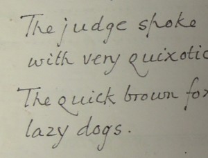
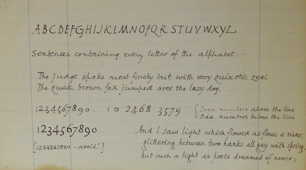
The specimens (now MS Add. 9831 A/1) contain two with examples of the whole alphabet, in upper and lower case (capitals and minuscules), together with numerals. Scholfield liked to add two sentences “The judge spoke most finely but with very quixotic zeal” and the more familiar “The quick brown fox jumped over the lazy dogs” (he seems to have preferred ‘jumped’ and ‘dogs’ to ‘jumps’ and ‘dog’, though there are other variants, one of them leaving out s altogether). Another specimen contains the sentences and numerals only, while the largest is a kind of sampler containing all these examples and a passage from Dante’s Paradiso xxx (translated by Bickersteth) beginning ‘And I saw light which flowed as flows a river …’ and so on for a total of nine lines.
Scholfield’s hand was considered of sufficient distinction (p 79 plate 34 (a)) to be included in Wilfrid Blunt’s Book Sweet Roman Hand: five hundred years of Italic Cursive Script, published in 1952 (London, James Barrie) at the apogee of the revival of the Renaissance Italic hand which had been developing in Britain for the previous fifty years or thereabouts. It surveys a considerable variety of cursive hands practised by many of Blunt’s contemporaries. Blunt was a drawing master at Eton, and taught his pupils Italic script, though Scholfield, albeit an Etonian, must have learned his earlier. The specimen reproduced is described by Blunt (p 98) as ‘very flowing’, and with occasional use of the long s.
In fact Scholfield’s hand is rather different from most of the more conventional forms of Italic reproduced by Blunt. As our specimens show, the long s mentioned by Blunt was not normally to be used by Library staff, however. Instead, the open letter p with a high ascender was characteristic , in more than one variant form , and Scholfield was careful to emphasise a long capital J extending below the line, and without a serif at the top; moreover, the centre strokes of M and W must take full advantage of the space to be filled. Width of capitals was important, with the proportions between letters as carefully spaced out as a printer would insist upon (it was a golden age of type design, as our collections of printers’ papers amply demonstrate). Among the minuscule letters, some ascenders (l, or the open p) are higher than others (t and h). Y, and g (when the double-bowed form is not used) have long descenders with small finely-crafted hooks. Above all, there is a tremendously assured sloping angle to the script which gives it an elegant legibility. It was complemented by a set of numerals ‘even numbers above the line; odd numbers below the line’ (other than 0 and 1 which are written small and on the line); the principle is still worth applying, provided it is remembered that 4 is in fact an even number below the line (Scholfield seems to have ignored this).
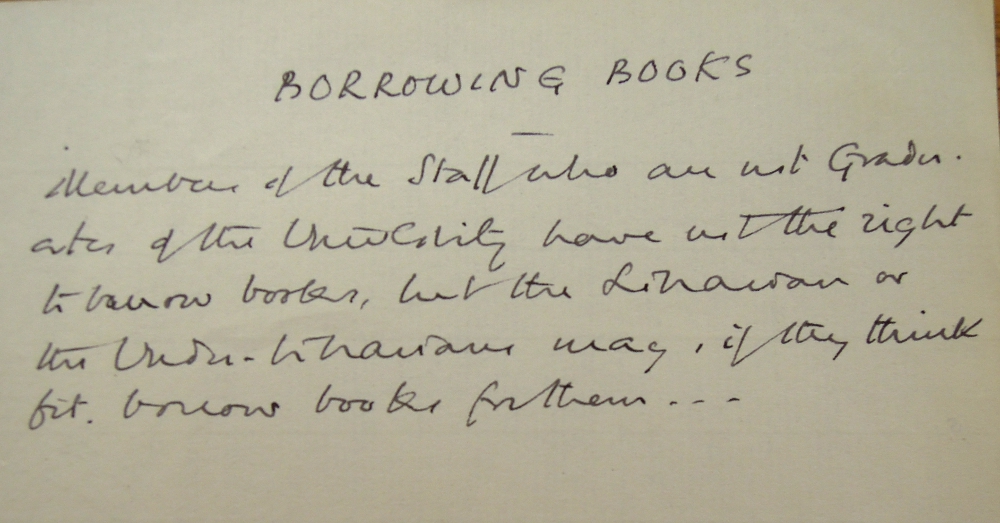
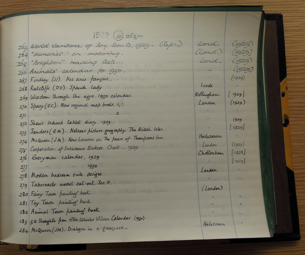
The hand was zealously copied by assistant (“non-graduate”) staff who achieved such proficiency in it that it was not always possible to tell two men’s hands apart. Mistakes by one assistant might be misattributed to another, perhaps even to a senior. The present writer’s Cambridge dentist was once bemused to discover that two of his patients wrote identical hands; both of them worked on the Library staff. The old Guard Book catalogue still exhibits annotations and corrections in the Library Hand, although with the passage of time and a certain amount of re-cataloguing and re-classifying these are becoming difficult to find. There are examples in the slip catalogue of the Upper Library, and there are still magnificent examples of whole pages in the Hand in the class catalogues (shelf lists) used by staff, not least in the Upper Library, where entering of new books was done mainly by assistant staff. Officer, that is, graduate, staff were less likely to write the Library Hand unless they were former assistants who had come up through the ranks. But there were officers themselves who developed distinguished variants on the Italic hand, or alternatives to it, priding themselves on combining clarity with elegance. A good hand, mindful of tradition, was one of the indicators of scholarly acumen which a Cambridge librarian should exhibit, and Scholfield would notice and respect it. Scholfield’s Library Hand however was unique in the way it paid regard to the proportions not only of the letters, but of the page. In so doing it evoked an atmosphere of competence, even of leisure in composition, which made it easy and a pleasure to read. The Library Hand demonstrated the value which Scholfield’s famed attention in regard to detail could have in the creation of enduring Library documents.
Jayne Ringrose


Pingback: Historical donations to the University Library | European languages across borders