Pictures, Perspectives and Plans
Home to an exceptional density of features that can be mapped, all contained within a concentrated area, cartographers have long been drawn to towns and cities as a subject for their work. The theme of this year’s Cambridge Science Festival ‘structures and patterns’ provided an excellent opportunity to examine how the styles of cartography used in this genre of mapping have changed and developed using some fascinating original examples from the Library’s collections.

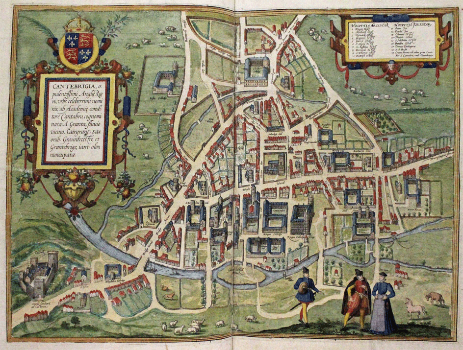
An extract from Braun & Hogenberg’s map of Cambridge (1575). Atlas.4.57.3
This post follows on from the Festival talk titled ‘Pictures, Perspectives and Plans’, given at the University Library on Tuesday 11 March, which focused on printed town mapping from the 15th century to the present day and takes a look at some of the styles of cartography that were explored during this event.
Early printed maps of towns and cities often took the form of a generalised pictorial view and in many cases were nothing more than an imaginary sketch, often reused with no alteration to represent multiple locations.
The Liber Chronicarum (or Nuremberg Chronicle as it is widely called) by Hartmann Schedel is a fine example of this. Printed in Nuremberg by Anton Koberger in 1493 the Chronicle is one of the most important German incunables and most extensively illustrated book of the 15th century. Inside are over 100 named views of places. The depiction of Venice, for example, provides a recognisable view of the city where as the plans of Naples, Verona, Siena and Damascus are all identical and bear no relation to reality – over half of the views depicted were made from just 14 woodcuts and less than a quarter are approximate to the actual scene. This pictorial style, which some may question whether it can truly be classed as a map, remained a popular method of portraying towns well into the sixteenth century. Detailed and accurate depictions of place were clearly not as important to the creators and audience of this work as they were to become to many in the following centuries.

Verona, Naples, Siena and Damascus from the Nuremberg Chronicle (1493). Inc.0.A.7.2[888]
The publication, in 1574, of the first volume of George Braun and Franz Hogenberg’s ground breaking Civitates Orbis Terrarum was the first time a work had been dedicated solely to the mapping of towns and cities. In setting out his plans for this work Braun stated that all towns should be drawn in such a manner that the viewer can look into all the roads and streets and see also all the buildings and open spaces. The bird’s-eye view is the ideal cartographic means to achieve this aim.
As is common in this style the maps in all six volumes of Civitates are drawn with minimal reference to scale, proportion or relevant position of buildings, however, the buildings shown did exist. The map of Cambridge, from the second volume, gives much greater prominence to college buildings showing the importance attributed to them over non collegiate structures. Braun was careful to include the proper names of places on his maps with a Latin description on the verso “so as to satisfy both the learned and unlettered.”
Produced with the assistance of Abraham Ortelius who, in 1570, had published what is recognised as the first world atlas, Civitates introduced a fashion for town books that lasted well into the 18th century. The impact of these atlases and the growing appreciation of cartography as a whole can be seen in the following quote from Robert Burton in The Anatomy of Melancholy (1621):
To some kind of men it is an extraordinary delight to study, to looke upon a geographicall map and to behold, as it were, all the remote provinces, towns, citties of the world … what greater pleasure can there be then … to peruse those books of citties, put out by Braunus and Hogenbergius.
Cambridge from Civitates Orbis Terrarum by George Braun and Franz Hogenberg (1575). Atlas.4.57.3
The late 17th and 18th centuries saw the start of a transition from speculative mapping to more precise documentation based on ground observation and improved instrument surveying techniques employed by geographers and scientists. During this period the pictorial elements of earlier maps get pushed towards the borders and the depictions of building elevations seen in the bird’s-eye style are sparsely used.
David Loggan’s map of Cambridge, 1688, shows this changing cartographic style, being drawn as if seen vertically from above. It provides a very detailed and accurate two dimensional plan of the city and is the earliest map of Cambridge that approaches what we may expect from a modern map.
In the years since the last detailed map of the city had been produced (by John Hammond in 1592) Cambridge had seen great growth in terms of population but the city had not extended outwards to any great degree due largely to the surrounding common fields. This growth along with a larger University and increase in commercial activity meant greater pressure on space and this can be seen through the greater intensity of housing, the building over of some previously open spaces and the buildings now covering much of the land behind street frontages.

An extract from David Loggan’s map of Cambridge (1688). Ii.9.7
During this period many houses, especially around the market, had been rebuilt with extra storeys, although this is not reflected on the map as it would have been if drawn in the bird’s-eye style of earlier plans.
Another reason for the movement towards more precise mapping was that improvements in surveying techniques had led to greater expectations from the public that town plans would be produced to a higher standard of accuracy – an attractive picture and approximation of the position of features in the landscape was no longer good enough.
This demand is highlighted in William Maitland’s preface to his Survey of London (1739) in which he complains that although he wanted to include a map in his publication, those available were defective and would be a disgrace rather than an embellishment to his work.
This was a difficult period for map publishing in England. The cost of producing the accurate surveys that were now expected could often not be recouped from sales of the published work and many mapmakers faced bankruptcy. John Rocque, one of the most prolific and famous mapmakers of the 18th century escaped this trend by diversifying his output (producing county maps, plans of large estates, gardens and parks alongside many town and city maps) and attracting the patronage of the Crown and aristocracy who were willing to underwrite the expenses of such surveys.

An extract around Covent Garden from John Rocque’s ‘A plan of the cities of London and Westminster and Borough of Southwark with the contiguous buildings’ (1746). Atlas.3.74.2
The work for which he is most renowned is his survey of London published in 1746. Taking almost nine years to complete the map was produced on 24 sheets measuring over six by thirteen feet and showed London at a scale of 26 inches to the mile. Surveyed by trigonometrical observation from towers and other tall buildings around the city and the combining of these results with instrumental measurements of angles and distances taken on the ground, Rocque’s map was the most detailed and accurate plan of the city to have been produced.
He was aware of all the important details that needed to be included (flagging churches, schools, banks, courts, hospitals etc.) and used symbology widely to distinguish key features including large houses with gardens, making his plan conform in many ways to the standards we would expect from a modern topographic map today.
In the same year he was also able to publish a plan of London and its suburbs, extending this style of mapping beyond the centre of the city, albeit at a smaller scale.

Woolwich from John Rocque’s ‘A new and accurate survey of the cities of London and Westminster, the borough of Southwark : with the country about it for nineteen miles in length, and thirteen in depth’ (1748). Atlas.2.74.3
The industrial revolution of the 19th century and resulting rapid urban expansion led to the requirement to revise and reissue plans at a much faster rate than had previously been expected to keep pace with a more mobile and literate population. The development of new industrialised printing techniques, moving away from the practice of engraving on copper allowed cartographers to keep pace with this demand.
In Europe large scale topographical surveys were being undertaken by official organisations. In Britain these were produced by the Ordnance Survey.
Born out of the eighteenth-century military need for detailed reliable topographic maps at a time of war with Scotland and threat of invasion from France, by the middle of the nineteenth century the Ordnance Survey responded to growing concerns over public health in industrial cities by producing their town plan series at a scale of 5 or 10 feet to the mile for most major urban areas. By the end of the century they stated that urban Britain had been mapped to a scale ‘sufficiently large enough to show detail down to the size of a doorstep.’

Ordnance Survey Town Plan of Cambridge (1888). Maps.OS.Tp.Cambridge.26
Cambridge was surveyed in 1886 and the resultant maps were published in 1888. The level of detail achieved can be seen in the description given to the internal layout of many of the college buildings including the site of the original University Library.
As well as these highly detailed topographic series, town and city maps were being mass produced as practical guides for a much wider audience who were able to travel in greater numbers to cities around the world.

The ribbon across the ‘Instantaneous indicator new plan of Paris’ (ca. 1860). Maps.c.18.H.116
The Instantaneous indicator new plan of Paris (ca. 1860) is an interesting example of this style of mapping. Featuring its patented ‘Systeme Acklin’ that located streets and features within the city using numbers along a moveable ribbon combined with those around the map edge this seems an unnecessarily complicated system by today’s standards.

Guide showing how to use the ‘Systême Acklin’ on the ‘Instantaneous indicator new plan of Paris’ (ca. 1860). Maps.c.18.H.116
Although it didn’t catch on in great numbers, this shows that now increasingly detailed and accurate mapping was more widely available, people were discovering and experimenting with maps in many different ways. This new experimentation can also be seen in the rise of thematic mapping of towns and cities that started to be produced at this time, from the fire insurance plans produced by the Chas E. Goad Company to Charles Booth’s London poverty maps.
A wealthy London ship owner who became interested in the problems of poverty and unemployment affecting the city at this time Booth was, however, sceptical of the levels of poverty reported to exist in the literature of the time. In 1885 a report in the Pall Mall Gazette claimed that 25% of the capital’s population lived in poverty. This report incited Booth to carry out his own research to prove that the authors of this paper had overstated their case for propaganda purposes.
He recruited a team of volunteers who collected all available data and statistics and plotted these onto an Ordnance Survey plan of the city highlighting categories of socio-economic status. The resulting work proved that the 1885 research was indeed wrong, 25% of the population were not in poverty, the actual figure was over 30% (35% for the East End of London).
The 20th century saw the rapid advancement of modern technologies such as photography, aviation and satellite imagery that transformed the way maps were produced and the levels of detail that could be depicted.
While photography led to the unveiling of a wealth of detail in the urban landscape, satellite imagery improved the accuracy, speed and capacity for revision that was becoming essential in both military situations and in meeting public demand.

An extract showing the centre of Cambridge from the Soviet military town plan (1986). Atlas.0.019.4
During the cold war period the Soviet military produced detailed maps of most large towns and cities around the world. Marked secret and unknown in the west until the fall of the Soviet Union, they undoubtedly made use of aerial imagery and satellite technologies alongside other means in the production of these maps. It is a process that must have involved thousands of people with all maps produced using a consistent style and set of symbols to ensure they were comprehensible to any trained member of the Soviet military no matter which area of the world they were looking at. The map of Cambridge, published in 1986, shows the Science Park to the north of the city in a much more advanced state than was shown on contemporary UK published maps, showing these were not mere copies of existing publications.
Throughout the advancement of more detailed and accurate mapping, older styles of cartography employing pictorial elements have not disappeared. People are still inspired to produce artistic views of our urban landscapes. The Wonderground map of London Town by Macdonald Gill, produced in 1914 at the outbreak of the First World War, provides a bright lively depiction of London and its transport network in stark contrast the political situation of the day.

An extract from ‘The Wonderground map of London town’ (1914). Maps.72.91.15
Pictorial maps such as this still have a role to play and can reveal features and details of the urban landscape that more scientifically accurate plans have difficulty reproducing. They have now formed a specific genre of mapping that sits alongside scientifically accurate topographic plans.
Maps of towns and cities have been in existence for thousands of years, produced by many of the oldest urban civilizations on a wide variety of materials, from early wall paintings to the marble tablets of the large scale plan of Rome, known as the Forma Urbis Romae, engraved in 203-211 AD. This post provides a brief insight into a small subset of this overall picture, it certainly doesn’t start at the beginning and nor does it finish at the end of the story of town mapping. Although many view todays town and city maps through the eyes of online providers such as Google and OpenStreetMap the increase in the availability and ease of use of mapping data shows the potential for an exciting future in the development of the mapping of our towns and cities.